.png)
たからものはふつうの日
Children’s Book Illustration
A story about the difficulty of being “ordinary” and the preciousness of living today, told through the irreplaceable moments of everyday life.


ABOUT THE PROJECT
About
This picture book was created to gently remind us of something we often forget —
that ordinary days are, in fact, irreplaceable.
Inspired by a real story of a child living with illness, the project carries a quiet message:
to live fully in the present moment,
and
to recognize the beauty in what seems “normal.”


Character Design
The characters were designed to hold emotional clarity and softness. Each expression and posture was carefully explored to create a sense of safety and presence.
Daichi
Daichi is the main character of the story. He is a bright, cheerful boy who brings smiles to the people around him, like the sun itself. Even while living with illness, he does not let it define him and continues to live each day to the fullest.


Bright and positive
Playful smile
Stylish fashion
Naturally curly hair
A balance of childlike charm and quiet maturity


Sora
Sora is the bear who stays by Daichi’s side. Though he never speaks, he is portrayed as a quiet and comforting presence. If Daichi is like the sun, Sora is like the moon. He gently watches over Daichi with a constant sense of warmth and reassurance.


Calm and quiet presence
Emotions expressed through gestures and expressions
Gentle and comforting
Holds a deep sense of love


Together
Daichi and Sora share a bond like brothers. Even without words, they understand each other, and simply being together becomes a source of comfort and support.
Their relationship is portrayed through warmth, touch, and a quiet emotional connection.


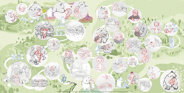
Illustration Process
Each illustration was developed through a gentle, layered process:
from rough emotional composition,
to refined structure,
to final color that supports the atmosphere of the story.
1

Layout
2
Rough Sketch
3

Sketch Revision
4

Refined Scketches
5

Color


Book Cover
The cover illustration was created to gently draw the reader in, balancing warmth, stillness, and emotional depth. The title and front cover typography were designed to harmonize with the illustration, supporting a calm and inviting visual tone.


Endpaper
Multiple endpaper variations were explored to find the right emotional tone. Color choices were carefully considered to support the overall experience of the book.

Starry Sky
Option 1 (rough sketch)
A gentle composition of Daichi and Sora within a star-filled scene. Scattered motifs connect to the story, with small details that invite quiet discovery.


Daichi
Option 2 (rough sketch)
A composition centered on Daichi.
A bear-shaped motif subtly suggests Sora’s quiet, supportive presence.


Sora
Option 3 (rough sketch)
A minimal design based on Sora’s face.
A soft, slightly antique tone creates a calm, retro atmosphere.


Based on an essay written by Daichi Doi during his middle school years,
this children's book was created in memory of his life after his battle with childhood cancer.
Funded through crowdfunding and donated to hospitals and schools,
the book gently encourages readers of all ages to reflect on the value of everyday life,
compassion for others, and the meaning of life itself.
( Pilina Website )
Media Coverage
Treasure Is an Ordinary Day has been featured by television, newspapers, and online media for its message of cherishing everyday life and supporting children affected by cancer.


Project Summary
Role: Illustration, Character Design, Book Design
Pages: 24
Medium: Digital / Watercolor style
Year: 2026